
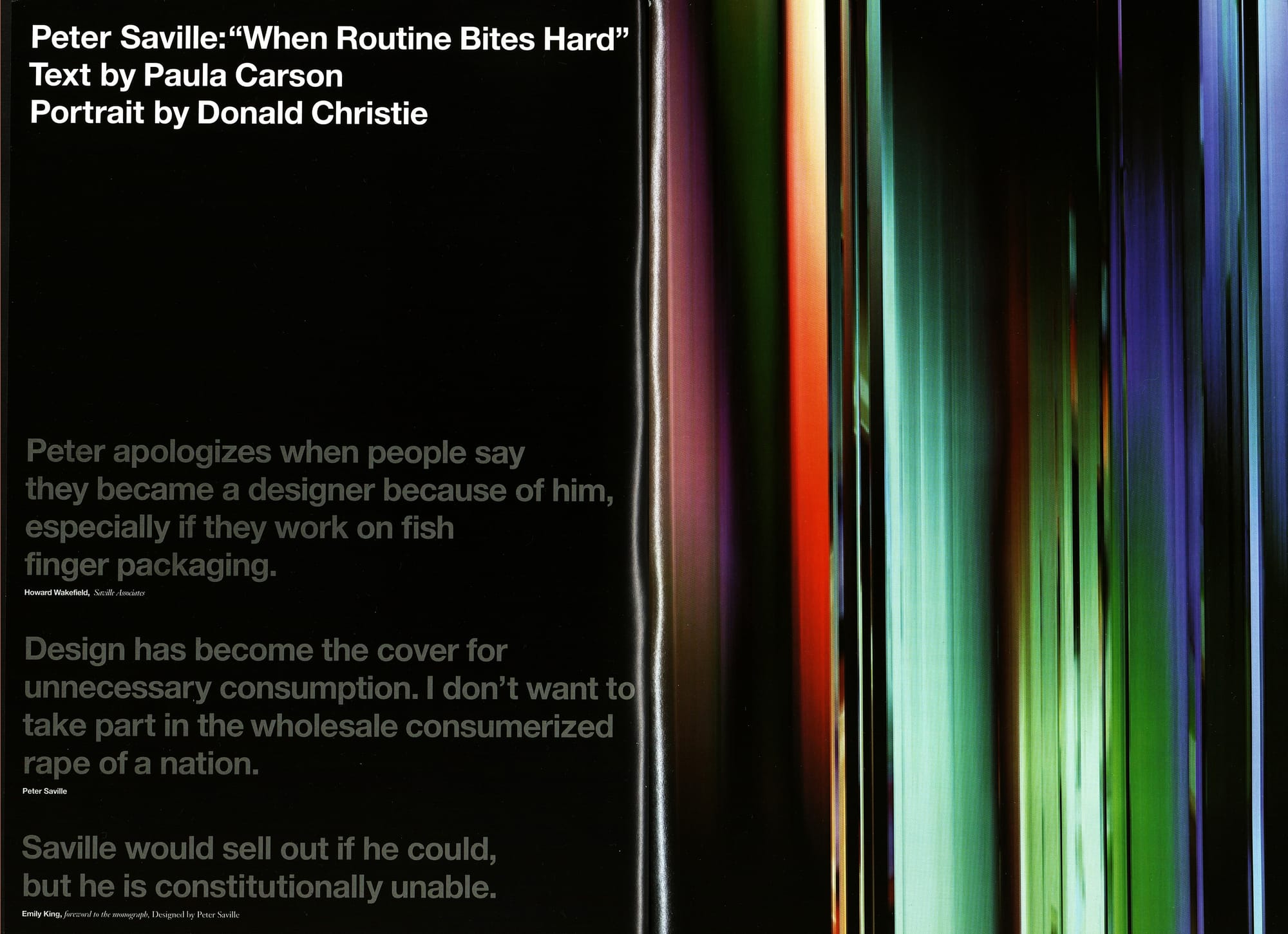
'Peter Saville: When Routine Bites Hard' - Graphis Magazine July 2004
Text by Paula Carson
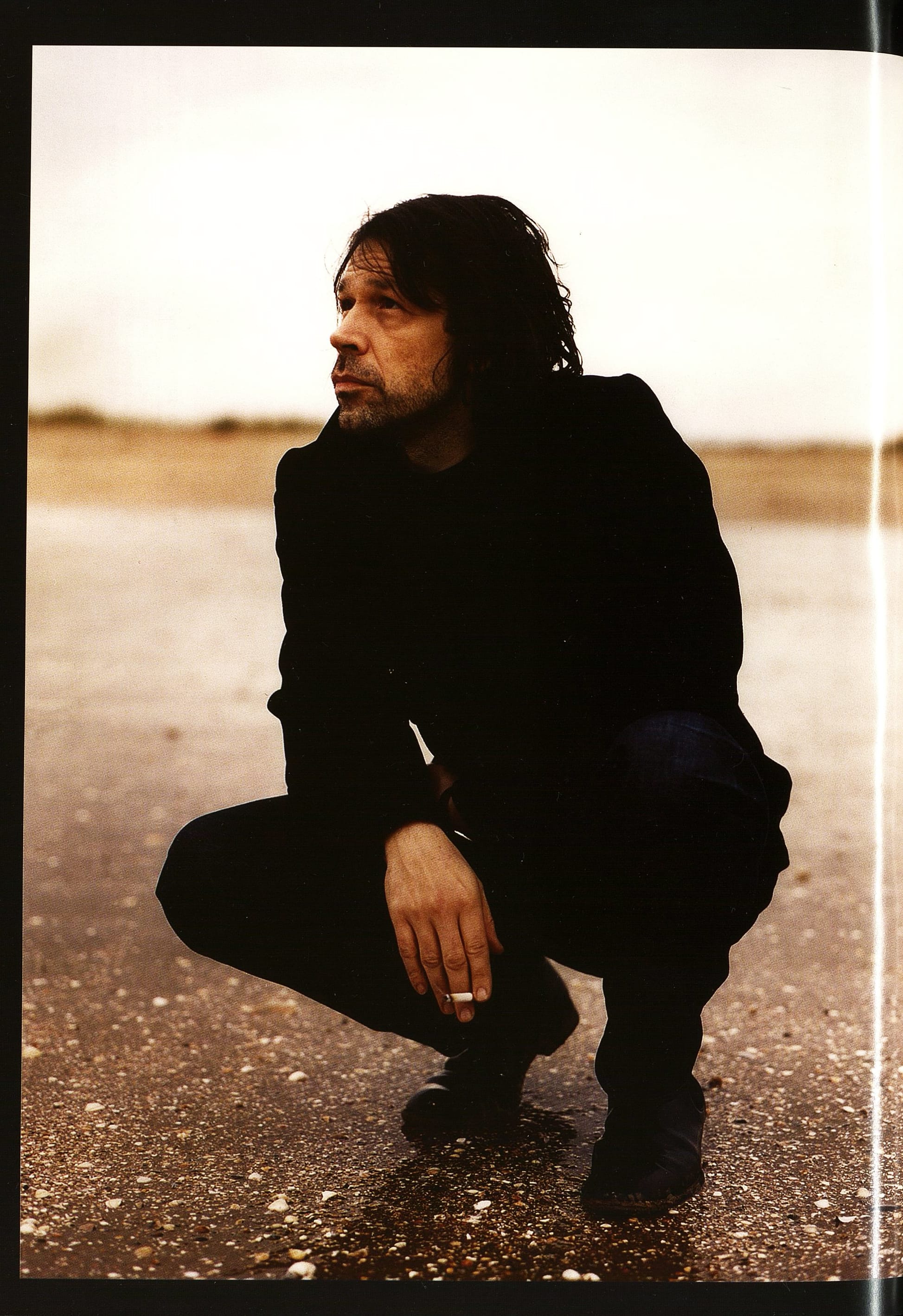
Portrait by Donald Christie
"Peter apologizes when people say they became a designer because of him, especially if they work on fish finger packaging." - Howard Wakefield, Saville Associates
"Design has become the cover for unnecessary consumption. I don't want to take part in the wholesale consumerized rape of a nation." - Peter Saville
"Saville would sell out if he could, but he is constitutionally unable." - Emily King, foreword to the monograph, Designed by Peter Saville
For those not au fait with Peter Saville, here's the abridged version: born in Manchester, England in 1955, he studied graphic design at the city's Polytechnic, before becoming a founding partner of Manchester's Factory Records in 1979.
There he created sleeves for the likes of Joy Division, New Order, and Orchestral Manoeuvres In The Dark. Establishing studio Peter Saville Associates in London in 1983, he worked for, among others, Roxy Music and Peter Gabriel. In 1990 be became a partner at Pentagram, leaving in 1993 to assume the role of creative director at Frankfurt Balkind, Los Angeles. In 1995 he returned to London, where he set up The Apartment, an office for German communications company Meiré und Meiré. Now be operates under the banner Saville Associates he generally works collaboratively, his output over the years owing much to the likes of designers Brett Wickens and Howard Wakefield, as well as photographers Nick Knight and the late Trevor Key). Beyond the music industry, his fashion clients have included Yohji Yamamoto, Dior, Givenchy, and Stella McCartney. Saville continues to work commercially, producing record sleeves for bands such as Pulp and Suede. In March this year he was appointed creative director of his hometown Manchester: a role which essentially makes him a brand guardian for the city. He recently published a monograph Designed By Peter Saville through Frieze. The Peter Saville Show, a retrospective of his life's work organized by London's Design Museum, is currently touring internationally.
"I like art that grows up not knowing that it's art," says Peter Saville, referring to a favorite Claes Oldenburg quote. It's a phrase that offers an interesting insight into the juncture at which Saville now finds himself. The past thirty years have been a slow, sometimes painful "getting of wisdom" process for the famous British designer: Influential and celebrated he certainly is, but he's also spent years struggling to find a place for himself in the world of graphic communication. Now, he's discovering that the only route is to do what he always did best, to simply pursue his own vision. There's a big reputation surrounding the name. Saville is renowned for his anti-social working hours, lateness, stormy client relationships, impeccable fashion sense, and long nights at London's Groucho Club. "To work with Peter you have to understand that Peter never stops working. You have to embrace the long waits, the late night sessions, his perfectionist ideal, the Champions League, the Groucho Club and his impressions of comedians Paul Whitehouse and David Brent," affirms Saville Associates' Howard Wakefield.
Whether you buy into the Peter Saville myth or not, at the core, he remains synonymous with his timeless Factory sleeves. Encased behind bits of glass in The Peter Saville Show they look fantastic. Stashed against the wall of your boxy bedroom as a teenager they looked even better. Saville has lost count of the people—usually males in their 30s and 40s—who have approached him to say they got into design because of his work at Factory. "Peter apologizes when people say they became a designer because of him, especially if they work on fish finger packaging," comments Wakefield. "I too was influenced by Peter to become a designer. Who isn't? And thankfully by working with Peter, there are only sexy jobs." Saville's Factory covers were the first pieces of art many aspiring designers seriously learned to love. Saville didn't just change the way we look at music packaging - his vision helped change visual culture across the board.
From all accounts, Factory was a unique working environment. Answerable to neither band nor record label, Saville simply created sleeves to please himself. "I found a stage where I could pursue my own interests within the context of design. I have never had any other working situation that is comparable with it—probably because it doesn't exist," Saville comments. "I was not asked to service the records, I was just doing a piece of work that would be released that year along with the music. I was able to produce that piece of work in an autonomous zone, so it had to have a completeness in itself, because it was created independently of the music." In a sense, they weren't record covers at all. They certainly didn't look like them. Take Unknown Pleasures, Saville's first Joy Division sleeve: an uncompromising black square, centered by a flow of whitely drawn sonar pulses. An elegant piece of understatement—no band name, no mugshots, nothing to indicate that this was the first major release from a brand new record label-simply an impeccably sufficient object.
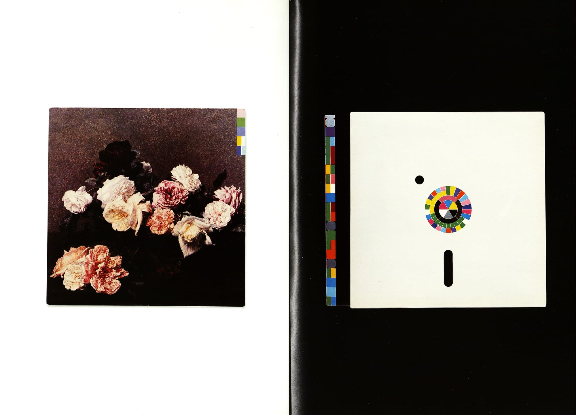
But then again, most of those covers are objets d'art. According to Rick Poynor, what "set Saville's designs apart from most of the competition was that they were conceptually lavish, too." Asked of his favorite from that period, Saville cites his sleeve for New Order's Power Corruption and Lies. While its cover reproduces a luxuriant still life of a bowl of roses by Henri Fantin-Latour, the reverse side resembles a floppy disk and uses a color-coded alphabet to "spell out" the words New Order and the album's title. Saville describes it as "romantic idealism juxtaposed against the modern, the technical, and the cool since one part is just incredibly florid and nostalgic whereas the other is completely cool and hard-edged." Saville describes the appropriation of the Fantin-Latour image as "work-ing in a kind of curatorial way, bringing together old and new." Growing up in Manchester and traveling to college each day from a semi-rural landscape to the inner city, he watched the two meld, the proximity of one enhancing the other. Saville, therefore, instinctively feels the charge of juxtaposition: of entwining discordant strands. Think of the cover for Joy Division's Closer: modern vinyl, swathed in classic typography and neo-clas-sical imagery—such a compellingly discordant object to hold in one's hand.
This so-called "curatorial approach" dominated the first decade of Saville's output. He calls it an "early form of sampling," the "edge" of which hinged upon startling the expectation. "I was using familiar codes, but shifting the context." Power Corruption and Lies, like many of Saville's designs, "depends on the sense of contextual displacement," Poynor observes. Saville's selected codes were not used arbitrarily: "They were appropriately picked and always idea-driven."
Gradually though, Saville questioned this referencing process: "I remember 20 years ago, after I'd cleverly quoted Muller-Brockmann and Jan Tschichold—I realized I'd competently copied some good people. But when I designed the sleeve for the True Faith album I didn't copy anyone—it was my own idea. I saw something from real life, a leaf floating past my car, and I thought, "That looks good.' So I started to challenge myself to do only new ideas, truly new ones."
However, originality and profitability make uneasy bedfellows. "There's no point confronting a client with a concept they don't get," Saville claims.
"In commercial work there's a comfort zone of rapid assimilation. It's already your favorite record cover, your favorite book jacket. You've seen it before... you get it straight away. Where would contemporary communications be without that sense of familiarity?"
At Factory, Saville claims, profit was never the bottom line. His ongoing refusal to bow to false idols has arguably been his greatest asset, but (for his bank balance at least) it's also his biggest problem. He is incapable of summoning interest or energy for that which has no integrity or originality. "His relationship with clients can be stormy, but I think that is because they don't realize how potentially good Peter is for them," says friend and collaborator Nick Knight. "They're not ready to accept his advice. Peter often comes up with the right answer and then the client tries to meddle with it—and when he's forced to compromise, Peter goes off the job because he's not interested any more."
"I only want to get out of bed for something that's worth doing," admits Saville resignedly. As a commercial designer, this makes his life difficult. He's not interested in shifting product for the sake of it. "Design has become the cover for unnecessary consumption," he comments. "So you go from being a rebel who wanted to change the system and improve the world, to being mercenary. I don't want to take part in the wholesale, consumerized rape of a nation. If people had the money, it might be more acceptable. But they actually don't, so it's offensive. If you don't actually respect the product itself how on earth can you encourage people to buy it? I would like to write across packaging and ad campaigns,
'Don't bother, you don't need it," he adds defiantly. Saville finds it quite dispiriting that his vision fed this very machine.
"We've seen 25 years of style running away with itself. It's not supposed to replace content; it's supposed to better reflect it. This is one of the reasons I feel design has devalued itself, and designers have devalued themselves," he comments. Saville's original aim was to make the everyday look better: so he put his own aspirations into the media available to him, and this sensibility has filtered through into more or less every product and shop you see around today. But if making the world look better was Saville's aim, then he'd be the first to say be careful what you wish for: "Content has sort of gone awol," he states, "image has become pre-eminent. It's a misleading and superficial state of affairs."
"Saville would sell out if he could," Emily King observes in the foreword to Designed by Peter Saville, "but he is constitutionally unable." In refusing to collude, Saville's ongoing dilemma is how to pursue a creatively rewarding life while staying financially afloat. Asked if he's happy, he replies, "If I could establish how to make my living now, then I would feel much happier." Saville Associates continues to operate, but Saville himself is increasingly drawn to avenues beyond graphic communication, "somewhere between the business of design and the business of art," columnist Peter York finds.
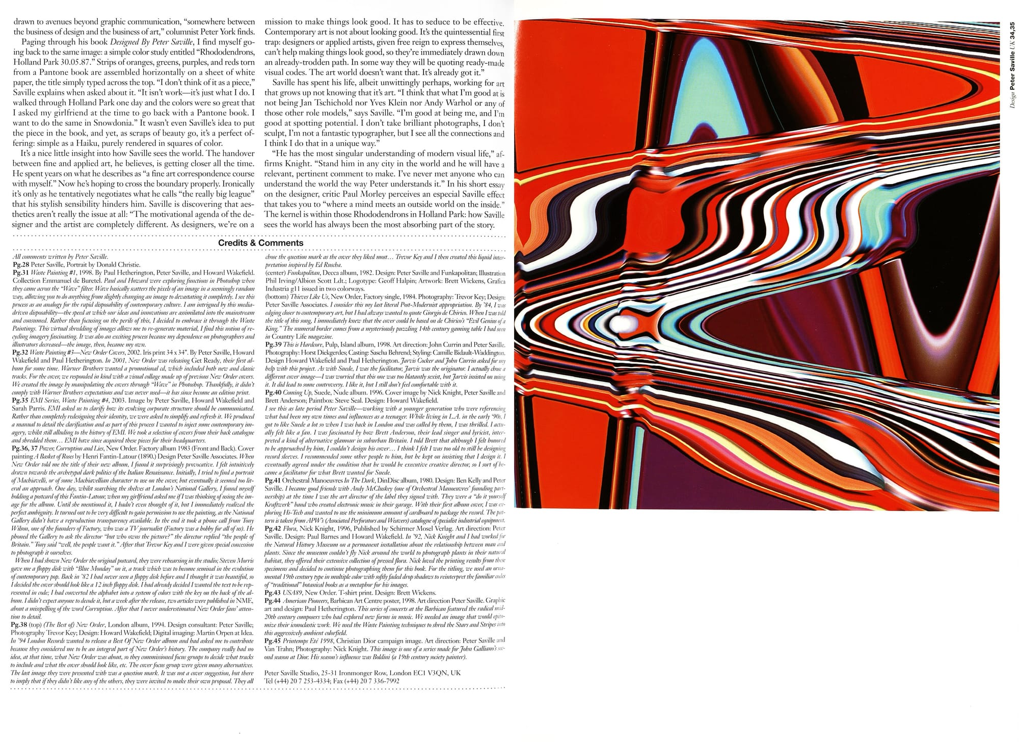
Paging through his book Designed By Peter Saville, I find myself going back to the same image: a simple color study entitled "Rhododendrons, Holland Park 30.05.87." Strips of oranges, greens, purples, and reds torn from a Pantone book are assembled horizontally on a sheet of white paper, the title simply typed across the top. "I don't think of it as a piece," Saville explains when asked about it. "It isn't work—it's just what I do. I walked through Holland Park one day and the colors were so great that I asked my girlfriend at the time to go back with a Pantone book. I want to do the same in Snowdonia." It wasn't even Saville's idea to put the piece in the book, and yet, as scraps of beauty go, it's a perfect of-fering: simple as a Haiku, purely rendered in squares of color.
It's a nice little insight into how Saville sees the world. The handover between fine and applied art, he believes, is getting closer all the time. He spent years on what he describes as "a fine art correspondence course with myself." Now he's hoping to cross the boundary properly. Ironically it's only as he tentatively negotiates what he calls "the really big league" that his stylish sensibility hinders him. Saville is discovering that aesthetics aren't really the issue at all: "The motivational agenda of the designer and the artist are completely different. As designers, we're on a mission to make things look good. It has to seduce to be effective. Contemporary art is not about looking good. It's the quintessential first trap: designers or applied artists, given free reign to express themselves. can't help making things look good, so they're immediately drawn down an already-trodden path. In some way they will be quoting ready-made visual codes. The art world doesn't want that. It's already got it."
Saville has spent his life, albeit unwittingly perhaps, working for art that grows up not knowing that it's art. "I think that what I'm good at is not being Jan Tschichold nor Yves Klein nor Andy Warhol or any of those other role models," says Saville. "I'm good at being me, and I'm good at spotting potential. I don't take brilliant photographs, I don't sculpt, I'm not a fantastic typographer, but I see all the connections and I think I do that in a unique way."
"He has the most singular understanding of modern visual life," affirms Knight. "Stand him in any city in the world and he will have a relevant, pertinent comment to make. I've never met anyone who can understand the world the way Peter understands it." In his short essay on the designer, critic Paul Morley perceives an especial Saville effect that takes you to "where a mind meets an outside world on the inside." The kernel is within those Rhododendrons in Holland Park: how Saville sees the world has always been the most absorbing part of the story.
Credits & Comments:
All comments written by Peter Saville.
Pg.28 Peter Saville, Portrait by Donald Christie.
Pg.31 Waste Painting #1, 1998. By Paul Hetherington, Peter Saville, and Howard Wakefield Collection Emmanuel de Buretel. Paul and Howard were exploring functions in Photoshop when they came across the "Wave" filter: Wave basically scatters the pixels of an image in a seemingly random way, allowing you to do anything from slightly changing an image to devastating it completely. I see this process as an analogy for the rapid disposability of contemporary culture. I am intrigued by this media - driven disposability - the speed at which our ideas and innovations are assimilated into the mainstream and consumed. Rather than focusing on the perils of this, 1 decided to embrace it through the Waste Paintings: This virtual shredding of images allows me to re-generate material, I find this notion of recycling imagery fascinating. It was also an exciting process because my dependence on photographers and illustrators decreased—the image, then, became my own.
Pg.32 Waste Painting #3—New Order Cover, 2002. Iris print 34 x 34". By Peter Saville, Howard Wakefield and Paul Hetherington. In 2001, New Order was releasing Get Ready, their first album for some time. Warner Brothers wanted a promotional ed, which included both new and classic tracks. For the cover, we responded in kind with a visual collage made up of previous New Order covers.
We created the image by manipulating the covers through "Wave" in Photoshop. Thankfully, it didn't comply with Warner Brothers expectations and was never used—it has since become an edition print.
Pg.35 EMI Series, Waste Painting #4, 2003. Image by Peter Saville, Howard Wakefield and Sarah Parris. EMIl asked us to clarify how its evolving corporate structure should be communicated.
Rather than completely redesigning their identity, we were asked to simplify and refresh it. We produced a manual to detail the darification and as part of this process I wanted to inject some contemporary im-agery, whilst still alluding to the history of EMII. We took a selection of covers from their back catalogue and shredded them... EMI have since acquired these pieces for their headquarters.
Pg.36, 37 Power; Corruption and Lies, New Order. Factory album 1983 (Front and Back). Cover painting A Basket of Roses by Henri Fantin-Latour (1890.) Design Peter Saville Associates. When New Order told me the title of their new album, I found it surprisingly provocative. I felt intuitively drawn towards the archetypal dark politics of the Italian Renaissance. Initially, I tried to find a portrait of Machiavelli, or of some Machiavellian character to use on the cover; but eventually it seemed too literal an approach. One day, whilst searching the shelves at London's National Gallery, 1 found myself holding a postcard of this Fantin-Latom; when my girlfriend asked me if I was thinking of using the image for the album. Until she mentioned it, I hadn't even thought of it, but I immediately realized the perfect ambiguity. It turned out to be very difficult to gain permission to use the painting, as the National Gallery didn't have a reproduction transparency available. In the end it took a phone call from Tony Wilson, one of the founders of Factory, who was a TV journalist (Factory was a hobby for all of us). He phoned the Gallery to ask the director "but who owns the picture?" the director replied "the people of Britain." Tony said "well, the people want it." After that Trevor Key and I were given special concession to photograph it ourselves.
When I had shown New Order the original postcard, they were rehearsing in the studio; Steven Morris gave me a floppy disk with "Blue Monday" on it, a track which was to become seminal in the evolution of contemporary pop. Back in '82 I had never seen a floppy disk before and I thought it was beautiful, so İ decided the cover should look like a 12 inch floppy disk. I had already decided I wanted the text to be represented in code; I had converted the alphabet into a system of colors with the key on the back of the al-bum. I didn't expect anyone to decode it, but a week after the release, two articles were published in NME, about a misspelling of the word Corruption. After that I never underestimated New Order fans' attention to detail.
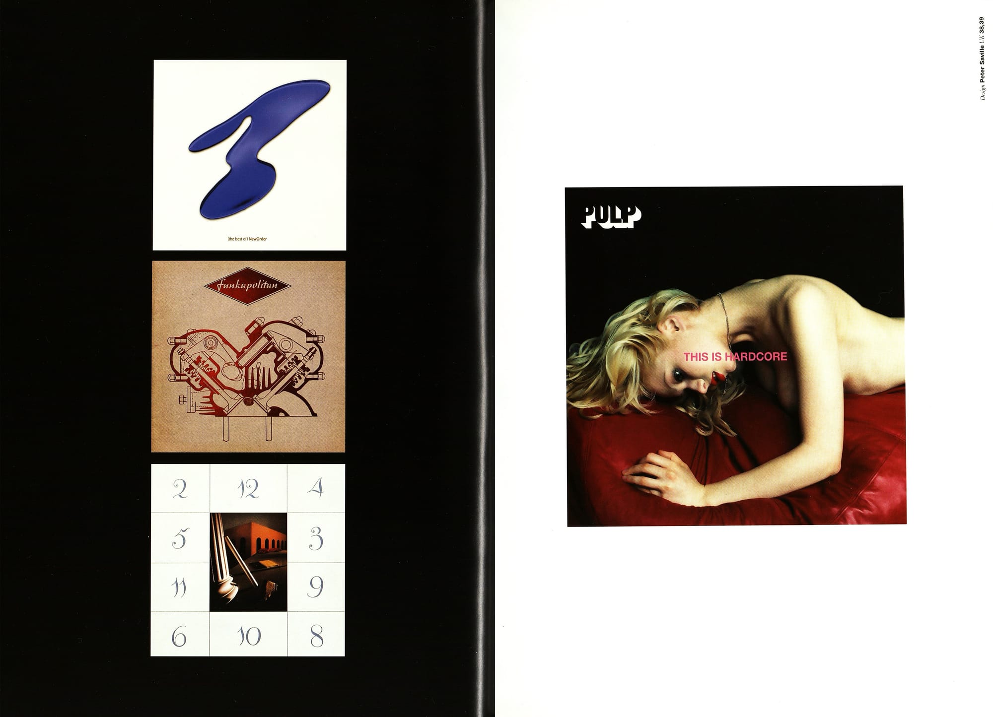
Pg.38 (top) (The Best of New Order, London album, 1994. Design consultant: Peter Saville; Photography Trevor Key; Design: Howard Wakefield; Digital imaging: Martin Orpen at Idea. In '94 London Records wanted to release a Best Of Now Order album and bad asked me to contribute because they considered me to be an integral part of New Order's bistory. The company really had no idea, at that time, what New Order was about, so they commissioned focus groups to decide what tracks to include and what the cover should look like, etc. The cover focus group were given many alternatives. The last image they were presented with was a question mark. It was not a cover suggestion, but there to imply that if they didn't like any of the others, they were invited to make their own proposal. They all chose the question mark as the cover they liked most. Trevor Key and I then created this liquid interpretation inspired by Ed Ruscha. (center) Funkapolitan, Decca album, 1982. Design: Peter Saville and Funkapolitan; Illustration Phil Irving/Albion Scott Ldt.; Logotype: Geoff Halpin; Artwork: Brett Wickens, Grafica Industria g1l issued in two colorways. (bottom) Thieves Like Us, New Order, Factory single, 1984. Photography: Trevor Key; Design: Peter Saville Associates. I consider this my last literal Post-Modernist appropriation. By '84, I was edging closer to contemporary art, but I had alvays wanted to quote Giorgio de Chirico. When I was told the title of this song, I immediately knew that the cover could be based on de Chiricos "Evil Genius of a King." The numeral border comes from a mysteriously puzzling 14th century gaming table I had seen in Country Life magazine.
Pg.39 This is Hardcore, Pulp, Island album, 1998. Art direction: John Currin and Peter Saville. Photography: Horst Diekgerdes; Casting: Sascha Behrend; Styling: Camille Bidault-Waddington. Design Howard Wakefield and Paul Hetherington. Jarvis Cocker and John Currin asked for my help with this project. As with Suede, I was the facilitator; Jarvis was the originator: I actually chose a different cover image—I was worried that this one was too blatantly sexist, but Jarvis insisted on using it. It did lead to some controversy. I like it, but I still don't feel comfortable with it.
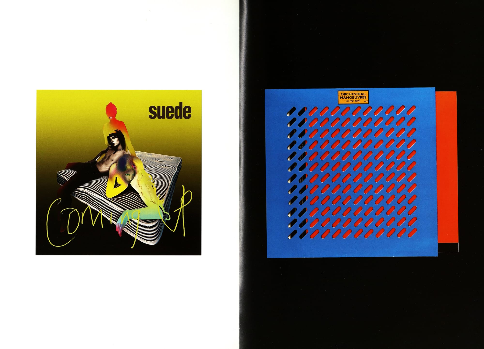
Pg.40 Coming Up, Suede, Nude album. 1996. Cover image by Nick Knight, Peter Saville and Brett Anderson; Paintbox: Steve Seal. Design: Howard Wakefield.
I see this as late period Peter Saville—working with a younger generation who were referencing what had been my own times and influences as a teenager: While living in L.A. in the carly '90s, I got to like Suede a lot so when I was back in London and was called by them, I was thrilled. I actually felt like a fan. I was fascinated by how Brett Anderson, their lead singer and lyricist, interpreted a kind of alternative glamour in suburban Britain. I told Brett that although I felt honored to be approached by him, 1 couldn't design his cover.. I think I felt I was too old to still be designing record sleeves. I recommended some other people to him, but he kept on insisting that I design it. I eventually agreed under the condition that he would be executive creative director; so I sort of became a facilitator for what Brett wanted for Suede.
Pg.41 Orchestral Manoeuvres In The Dark, DinDisc album, 1980. Design: Ben Kelly and Peter Saville. I became good friends with Andy McCluskey (one of Orchestral Manoeuvres' founding part-nership) at the time I was the art director of the label they signed with. They were a "do it yourself Kraftwerk" band who created electronic music in their garage. With their fust album cover, I was exploring Hi-Tech and wanted to use the minimum amount of cardboard to package the record. The pattern is taken from APWS (Asociated Perforators and Weavers) catalogue of specialist industrial equipment.
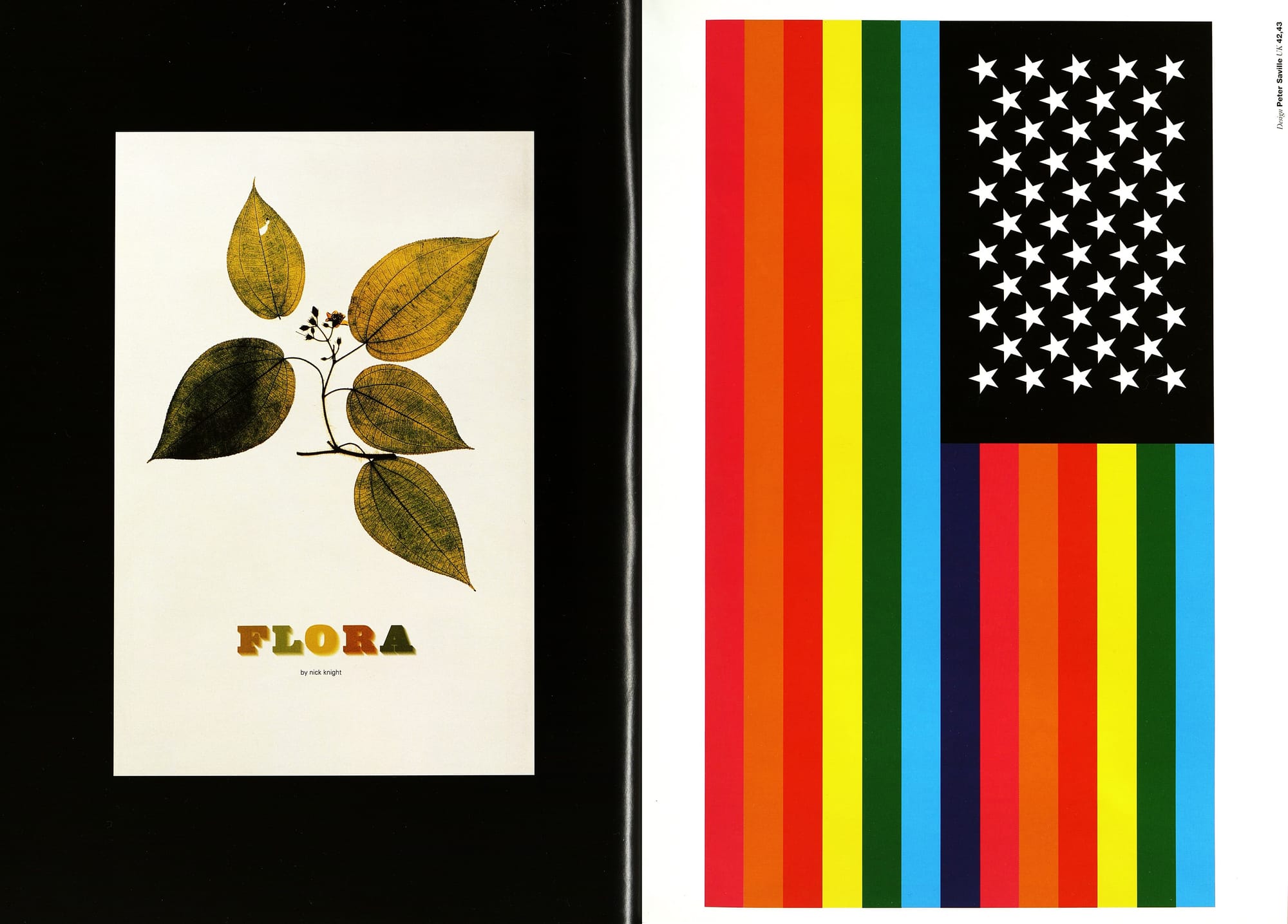
Pg.42 Flora, Nick Knight, 1996, Published by Schirmer Mosel Verlag. Art direction: Peter Saville. Design: Paul Barnes and Howard Wakefield. In '92, Nick Knight and I had worked for the Natural History Museum on a permanent installation about the relationship between man and plants. Since the museum couldn't fly Nick around the world to photograph plants in their natural habitat, they offered their extensive collection of pressed flora. Nick loved the printing results from these specimens and decided to continue photographing them for this book. For the titling, we used an ornamental 19th century type in multiple color with softly faded drop shadows to reinterpret the familiar codes of "traditional" botanical books as a metaphor for bis images.
Pg.43 USA89, New Order. T-shirt print. Design: Brett Wickens.
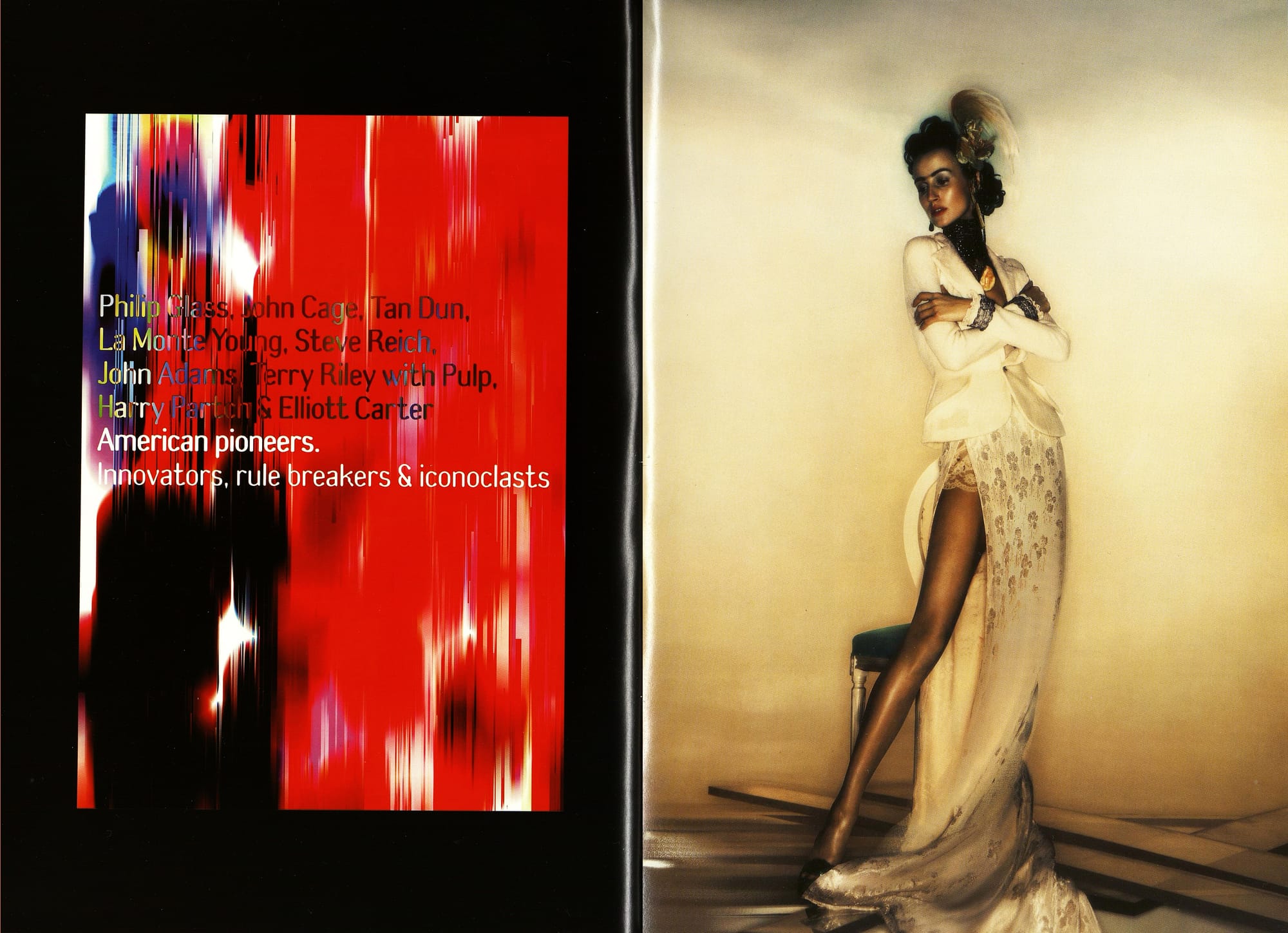
Pg.44 American Pioneers, Barbican Art Centre poster; 1998. Art direction Peter Saville. Graphic art and design: Paul Hetherington. This series of concerts at the Barbican featured the radical mid-20th century composers who had explored new forms in music. We needed an image that would epitomize their iconoclastic work. We used the Waste Painting techniques to shred the Stars and Stripes into this aggressively ambient color field.
Pg.45 Printemps Eté 1998, Christian Dior campaign image. Art direction: Peter Saville and Van Trahn; Photography: Nick Knight. This image is one of a series made for John Galliano's see-ond season at Dior: His season's influence was Boldini (a 19th century society painter).
Peter Saville Studio, 25-31 Ironmonger Row, London ECI V3QN, UK
Tel (+44) 20 7 253-4334; Fax (+44) 20 7 336-7992s