
'David Carson Revealed' International Design November 1995
Writer: Rick Poyner
With the publication of his book this fall, David Carson will attain a level of personal celebrity and influence that many designers dream about, but only the rarest will achieve. Constantly on the move between lectures and workshops all over the world, rarely out of the design magazines and increasingly the subject of wide media interest in glossy magazines and on television, Carson is now, unquestionably, the most famous graphic designer to have emerged in the 1990s.
In his laid-back, genial way, David Carson has shown a talent for putting himself about that verges on genius.
Everyone you talk to about him singles out his knack for publicity in tones close to awe. "He can promote himself like nobody else I've ever met," says Emigre magazine editor Rudy VanderLans, no slouch himself in the promotions department. Acutely sensitive to criticism and hungry — even by design business standards — for awards and acclaim, Carson is the most advanced model to date of a comparatively recent invention: the graphic designer as pop star. In his work, attitude and wander-lust, he is, in the words of his New York collaborator Mike Jurkovac, a "rock and roll typographer."
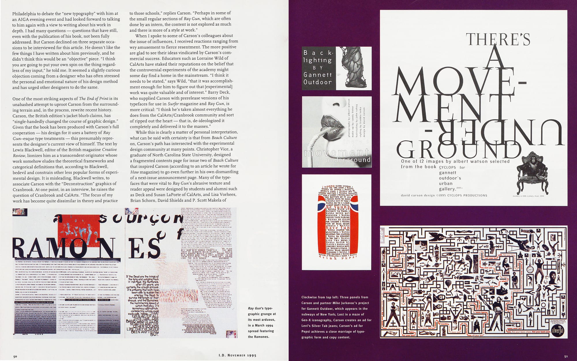
Carson's resumé unfolds in a series of exemplary sub-cultural moves. In the late 1970s, he was a pro surfer, achieving a top ranking of eighth in the world. After four years as a part-time designer at the "glorified fanzine" Transworld Skateboarding (by day he taught high school sociology) and a brief interlude at Musician, he caught the wave in 1989 as art director of the thinking sand-jock's surfing magazine, Beach Culture. Six little-seen issues and some 150 relentlessly press-released design awards later, Carson was firmly established among colleagues as the '90s art director most likely to succeed. Ray Gun, Marvin Scott Jarrett's "alternative" music magazine launched in November 1992, became Carson's most visible platform to date, winning him a following among disaffected young designers the world over. As we went to press, we learned that Carson and Jarrett's mutually beneficial working relationship had come to a sudden end, having run its course.
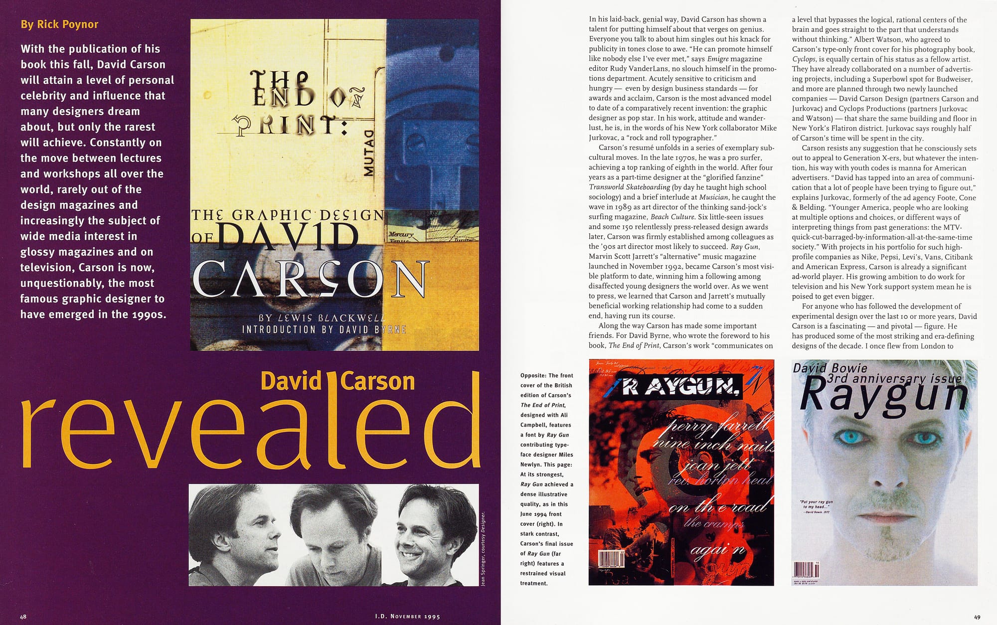
Along the way Carson has made some important friends. For David Byrne, who wrote the foreword to his book, The End of Print, Carson's work "communicates on a level that bypasses the logical, rational centers of the brain and goes straight to the part that understands without thinking." Albert Watson, who agreed to Carson's type-only front cover for his photography book, Cyclops, is equally certain of his status as a fellow artist.
They have already collaborated on a number of advertising projects, including a Superbowl spot for Budweiser, and more are planned through two newly launched companies — David Carson Design (partners Carson and Jurkovac) and Cyclops Productions (partners Jurkovac and Watson) - that share the same building and floor in New York's Flatiron district. Jurkovac says roughly half of Carson's time will be spent in the city.
Carson resists any suggestion that he consciously sets out to appeal to Generation X-ers, but whatever the inten-tion, his way with youth codes is manna for American advertisers. "David has tapped into an area of communication that a lot of people have been trying to figure out," explains Jurkovac, formerly of the ad agency Foote, Cone & Belding. "Younger America, people who are looking at multiple options and choices, or different ways of interpreting things from past generations: the MTV-quick-cut-barraged-by-information-all-at-the-same-time society." With projects in his portfolio for such high-profile companies as Nike, Pepsi, Levi's, Vans, Citibank and American Express, Carson is already a significant ad-world player. His growing ambition to do work for television and his New York support system mean he is poised to get even bigger.
For anyone who has followed the development of experimental design over the last 1o or more years, David Carson is a fascinating — and pivotal — figure. He has produced some of the most striking and era-defining designs of the decade. I once flew from London to Philadelphia to debate the "new typography" with him at an AIGA evening event and had looked forward to talking to him again with a view to writing about his work in depth. I had many questions - questions that have still, even with the publication of his book, not been fully addressed. But Carson declined on three separate occasions to be interviewed for this article. He doesn't like the few things I have written about him previously, and he didn't think this would be an "objective" piece. "I think you are going to put your own spin on the thing regardless of my input," he told me. It seemed a slightly curious objection coming from a designer who has often stressed the personal and emotional nature of his design method and has urged other designers to do the same.
One of the most striking aspects of The End of Print is its unabashed attempt to uproot Carson from the surrounding terrain and, in the process, rewrite recent history. Carson, the British edition's jacket blurb claims, has "single-handedly changed the course of graphic design." Given that the book has been produced with Carson's full cooperation -his design for it uses a battery of Ray Gun-esque type treatments — this presumably represents the designer's current view of himself. The text by Lewis Blackwell, editor of the British magazine Creative Review, lionizes him as a transcendent originator whose work somehow eludes the theoretical frameworks and categorical definitions that, according to Blackwell, bedevil and constrain other less popular forms of experimental design. It is misleading, Blackwell writes, to associate Carson with the "Deconstruction" graphics of Cranbrook. At one point, in an interview, he raises the question of Cranbrook and CalArts. "The focus of my work has become quite dissimilar in theory and practice to those schools," replies Carson. "Perhaps in some of the small regular sections of Ray Gun, which are often done by an intern, the content is not explored as much and there is more of a style at work."
When I spoke to some of Carson's colleagues about the issue of influences, I received reactions ranging from wry amusement to fierce resentment. The more positive are glad to see their ideas vindicated by Carson's commercial success. Educators such as Lorraine Wild of CalArts have staked their reputations on the belief that the controversial experiments of the academy might some day find a home in the mainstream. "I think it needs to be stated," says Wild, "that it was accomplishment enough for him to figure out that [experimental] work was quite valuable and of interest." Barry Deck, who supplied Carson with prerelease versions of his typefaces for use in Surfer magazine and Ray Gun, is more critical: "I think he's taken almost everything he does from the CalArts/Cranbrook community and sort of ripped out the heart — that is, de-ideologized it completely and delivered it to the masses."
While this is clearly a matter of personal interpretation, what can be said with certainty is that from Beach Culture on, Carson's path has intersected with the experimental design community at many points. Christopher Vice, a graduate of North Carolina State University, designed a fragmented contents page for issue two of Beach Culture that inspired Carson (according to an article he wrote for How magazine) to go even further in his own dismantling of a next-issue announcement page. Many of the typefaces that were vital to Ray Gun's abrasive texture and reader appeal were designed by students and alumni such as Deck and Susan LaPorte of CalArts, and Lisa Vorhees, Brian Schorn, David Shields and P. Scott Makela of Cranbrook. The names are listed in the front, but exactly who did what is not made clear to the annoyance of some. "He got so famous for work that included some of my own," says Deck, "that when people look at my work they sometimes think of him."
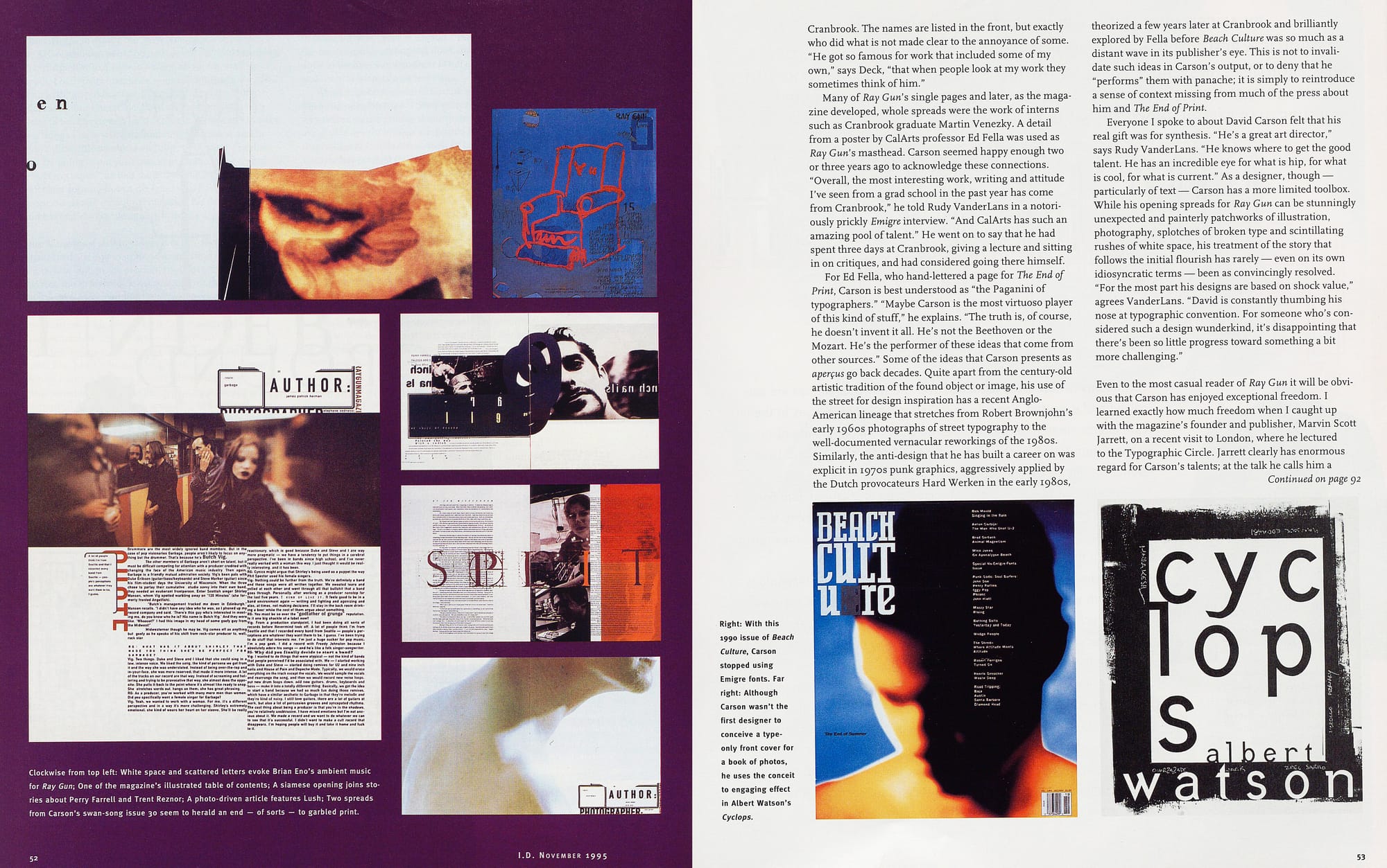
Many of Ray Gun's single pages and later, as the magazine developed, whole spreads were the work of interns such as Cranbrook graduate Martin Venezky. A detail from a poster by CalArts professor Ed Fella was used as Ray Gun's masthead. Carson seemed happy enough two or three years ago to acknowledge these connections.
"Overall, the most interesting work, writing and attitude I've seen from a grad school in the past year has come from Cranbrook," he told Rudy VanderLans in a notoriously prickly Emigre interview. "And CalArts has such an amazing pool of talent." He went on to say that he had spent three days at Cranbrook, giving a lecture and sitting in on critiques, and had considered going there himself.
For Ed Fella, who hand-lettered a page for The End of Print, Carson is best understood as "the Paganini of typographers." "Maybe Carson is the most virtuoso player of this kind of stuff," he explains. "The truth is, of course, he doesn't invent it all. He's not the Beethoven or the Mozart. He's the performer of these ideas that come from other sources." Some of the ideas that Carson presents as aperçus go back decades. Quite apart from the century-old artistic tradition of the found object or image, his use of the street for design inspiration has a recent Anglo-American lineage that stretches from Robert Brownjohn's early 196os photographs of street typography to the well-documented vernacular reworkings of the 1980s. Similarly, the anti-design that he has built a career on was explicit in 1970s punk graphics, aggressively applied by the Dutch provocateurs Hard Werken in the early 1980s, theorized a few years later at Cranbrook and brilliantly explored by Fella before Beach Culture was so much as a distant wave in its publisher's eye. This is not to invalidate such ideas in Carson's output, or to deny that he
"performs" them with panache; it is simply to reintroduce a sense of context missing from much of the press about him and The End of Print.
Everyone I spoke to about David Carson felt that his real gift was for synthesis. "He's a great art director," says Rudy VanderLans. "He knows where to get the good talent. He has an incredible eye for what is hip, for what is cool, for what is current." As a designer, though — particularly of text — Carson has a more limited toolbox. While his opening spreads for Ray Gun can be stunningly unexpected and painterly patchworks of illustration, photography, splotches of broken type and scintillating rushes of white space, his treatment of the story that follows the initial flourish has rarely — even on its own idiosyncratic terms - been as convincingly resolved. "For the most part his designs are based on shock value," agrees VanderLans. "David is constantly thumbing his nose at typographic convention. For someone who's considered such a design wunderkind, it's disappointing that there's been so little progress toward something a bit more challenging."
Even to the most casual reader of Ray Gun it will be obvious that Carson has enjoyed exceptional freedom. I learned exactly how much freedom when I caught up with the magazine's founder and publisher, Marvin Scott Jarrett, on a recent visit to London, where he lectured to the Typographic Circle. Jarrett clearly has enormous regard for Carson's talents; at the talk he calls him a "genius." But there is an undercurrent to what Jarrett tells me at his hotel that only makes sense some weeks later when he confirms that following a disagreement over the cover of the October issue he has let Carson go.
Carson and Jarrett have always worked at a distance — Carson in San Diego, Jarrett in LA. — with few meetings, "not even once an issue," according to Jarrett. He and Ray Gun's executive editor, Randy Bookasta, supplied Carson with edited copy on disk and most of the photography;
Carson commissioned some of the photography and all of the illustration. From then on he was completely on his own. The editorial office did not insist on page proofs. Often Jarrett would not even see the magazine, except for the cover, until it was printed.
Magazines are by their nature team creations. Their best moments are often forged in the close collaboration between editors and designers. The unusual circumstances of Ray Gun's production, with Carson's "interpretations" arriving as a fait accompli, meant these interactions could not occur. There could be no discussion, response, refinement or rethinking. It was already clear, during our London conversation, that Jarrett missed this involvement; his other magazines, Bikini and huH, are produced in-house.
Does he now believe, following Carson's departure, that the previous arrangements represented — as some design world observers committed to graphic authorship might have hoped — a viable model for magazine publishing? "It was certainly an interesting test," Jarrett says: "It worked for me for a while, but then it just started to get old." What he now wants to achieve with Ray. Gun is a "creative energy" between editors and designers. Portland design team Johnson & Wolverton have designed issue 31, with Bookasta working alongside them in their studio. "I am still giving my art directors more creative freedom than any other publisher on the planet," claims Jarrett, "and I'm a tremendous fan of great graphic design. But there comes a time when you've just got to say, 'Hey, wait a minute. This is a case of the tail wagging the dog.’"
Whatever its long-term viability, Ray Gun's first incarnation has been a notable success. The magazine has a readership of 150,000 and rising, and you only have to scan its letter pages - "Ray Gun is me!" — to see how it thrills its young audience. Yet beyond offering a sophisticated outlet for ordinary teenage rebellion, what does Ray Gun's much-vaunted visual "radicalism" actually stand for? "We still believe that music and the people who make it can change the world," spiels a 'Gos-sounding paean to rock and roll in issue one. Written by former Beach Culture editor Neil Feineman, who lasted four issues as Ray Gun's editorial director, this is clearly not Carson's view. "Graphic design will save the world right after jock and roll does," he observes ironically in The End of Print. It doesn't appear to be Jarrett's view either.
Jarrett told his Typographic Circle audience that he and Carson were nonconformists and anti-authority. But when I ask him later what exactly he is rebelling against, he answers — as Carson tends to answer such questions — in purely inward-looking professional terms: I'm rebelling against traditional publishing, constantly being challenged by my magazine distributors and consultants telling me I'm doing the wrong thing."
Feineman says that his own conception of the magazine "was all about giving disenfranchised people in the arts a voice." Still loyal to Carson, he seems wholly disenchanted with Ray Gun's routine music-biz content as it has developed. "What is amazing is that David has taken such standard fodder and put a new graphic spin on it," he says. "I can't think that without David, or at least somebody of David's ilk, that magazine would have lasted as long as it has, because it's certainly not worth reading." Earlier this year, Carson himself expressed a similar point of view a little more diplomatically in an interview on British television: "I firmly believe if you had done Ray Gun traditionally it wouldn't have survived. It's not that unique in the writing and it's a pretty narrow scope — a lot of band bios and things."
From the time of his earliest interviews, Carson has always insisted that his design approach is "conceptual." In other words, beneath the agitated surface lies a prob-lem-solving response to the content of an article based on his close reading of the text: there is an explainable reason for what you see on the page. His famous "Surfing blind" spread in Beach Culture — two pages of solid black, with only the headline for text — is a quintessential "big idea." What is genuinely remarkable, and a credit to Feineman's vision too, is that Carson was able to realize such an idea, and others just as memorable, without compromise in the pages of a magazine; many editors would have balked.
Ray Gun, though, is less clear cut. If Carson's later method really was a "conceptual" response to the editorial content, it would have been enlightening to learn from his book about the concepts behind familiar spreads: But when it comes to the inside story, The End of Print doesn't get much hotter than such lukewarm revelations as: "The attitude of this design involves a quiet laugh at optimum line length." Perhaps David Byrne comes closer to the essence of Carson's Ray Gun work when he talks about a form of "understanding without thinking" and likens the design's communicational effects to music.
Carson says in the book that as well as being a graphic designer, he considers himself an artist; the ultimate source of a designer's work, he once suggested, must come from within. "I set out to do things in an emotional way. When I turn to a page in a book, to a magazine, to any graphic design, I want an emotional reaction. That's probably the basis for how I judge it." Artists, of course, are under no obligation to explain what they do.
Seen in this way, Carson's huge appeal to advertisers makes perfect sense. For a designer without ideological baggage, pursuing a path of design for design's sake, it is the obvious next step. Advertising targets the emotions.
It bypasses the logical centers of the brain. It has no critical relationship to its own content (though as a strategy it sometimes pretends to). Mike Jurkovac worked with Carson on the launch of L2 worker jeans for Levi Strauss:
"David came back to us with a phenomenal packaging program that really helped reposition the brand. It was to appeal to the same target that David's Ray Gun magazine appeals to; the work he did was like a Rorschach collage.
When we did the testing on it, the kids were saying this is exactly how I feel in terms of life."
Does Carson's work (and other work like it) herald some fundamental typographic shift in the way not
just youth subcultures, but all of us will soon be commu-nicating? Jurkovac is sure that it does. He points to the usual technological factors, the Internet and 500-channel TV. "If you are going to try to do marketing or communi-cation, you have to take that into account." Carson himself has often explained his typographic operations in terms of a changing audience: "You can't give an 18-year-old a page of solid gray type and expect him or her to read it." Yet any magazine worth its salt, for any age group, proceeds from the starting point that unrelieved gray type looks dull, that pages should be lively and varied, and that the uncommitted browser will need to be seduced into reading. It's a gigantic conceptual and cultural leap from here to tangled columns, mutilated type and Carson's empirically untested claim in the New York Times that making readers work to decipher text may mean they remember more of what they read. It is certainly clear from Ray Gun's letters that many of its readers do find it heavy going, or even impossible to read on occasion. That is what they say they like about it. As one of Ray Gun's writers observed in a recent issue: "Just by opening this very magazine, you've gained admittance to an exclusive club."
New York-based designer Bill Drenttel — well known for his commitment to publishing and literature, and a Ray Gun admirer - speaks for many Carson watchers when he suggests that the "18-year-old reader" argument is cynical. "I'm not sure I buy that," he says. "I don't think reading is a lost cause. Employing alternative strategies of engaging people is great, but that doesn't necessarily lead to the conclusion that those are the only strategies. Or that people won't read if you don't engage in strategies that are only about new typography, as defined by people like David."
Excitingly iconoclastic as it seemed for a time, car-crash typography is now everywhere. Jarrett is bored with it. Some of Ray Gun's letter-writers are bored with it. Carson may well be bored with it, too. Before his exit cut short any plans he might have had, he had been talking about redesigning Ray Gun for more than a year. During his London lecture, Jarrett referred to something he called
"the new simplicity." Issue 28 contained a story on Neil Young consisting - perhaps it was a joke - of tall columns of solid gray type. With issue 29, Carson trashed the retinue of grunge-font suppliers for just three contributing typeface designers and some low-key, largely. sans serif fonts arranged in orderly rows.
The End of Print, on the other hand, is very much in his established, convention-busting style — a style which, despite the surprise value of seeing it within the traditionally more reserved pages of a book, is beginning to look distinctly tired. Is Carson, as Rudy VanderLans suggests, a "one-trick pony," whose lack of formal education in typography will limit what he can accomplish, or does he have the natural ability — the "genius" as some see it — to reinvent himself and retain his vanguard position? The new simplicity? The new something else? Or more of the same? All eyes are on him and it's his move.